AWS Business Intelligence Blog
Expand your dashboard design with font customization for axes and data labels in Amazon Quick Sight
Amazon Quick Sight, a capability of Amazon Quick Suite, transforms scattered enterprise data into actionable insights, helping organizations make faster, data-driven decisions at scale. In this post, we walk you through the new font customization features for axes and data labels in Quick Sight visuals, including step-by-step instructions and best practices for creating more readable and brand-consistent dashboards.
Why font customization matters
Typography plays a critical role in effective data visualization. Clear, well-chosen fonts help your audience read and understand data faster, make dashboards straightforward to read, and reinforce your organization’s identity.
Specifically, font customization can help you in the following ways:
- Improve readability for users, including those with visual impairments or those viewing dashboards on smaller screens
- Establish a visual hierarchy, guiding attention to key information (for example, axis titles vs. axis labels)
- Reinforce branding, ensuring your dashboards align with professional design standards
To learn more, refer to Elevate your dashboards with font customization in Amazon QuickSight.
Solution overview
The latest Quick Sight update introduces comprehensive text styling options for data labels and both X- and Y-axes across supported chart types (refer to our Axes and grid lines on visual types in Quick Suite and Data labels on visual types in Quick Suite for the full list of supported chart types). New capabilities include:
- Pixel-level control over font size
- Choice of font family
- Text styling: bold, italic, underline
- Custom text colors
These new features extend customization to axes and labels—complementing existing options for legends and titles—to give you finer control over your dashboard’s visual design.
This post walks you through the new font customization features for axes and data labels in Quick Sight charts. With these enhancements, you can fine-tune the look and feel of your dashboards to better align with your organization’s branding and improve readability for end-users. Specifically, we demonstrate the following:
- Configure font properties for chart axes and data labels
- Apply consistent typography across your dashboards
- Implement best practices for readability
Prerequisites
Before you begin, make sure you have the following:
- An active Quick Sight Standard or Enterprise Edition subscription
- Author or Admin access to Quick Sight
- At least one visual (chart or graph) created in your dashboard
Customize your chart axes and data labels
As an author, you can start customizing fonts for chart axes and data labels in just a few steps. To modify the font settings for chart axes, complete the following steps:
- Open your analysis in edit mode.
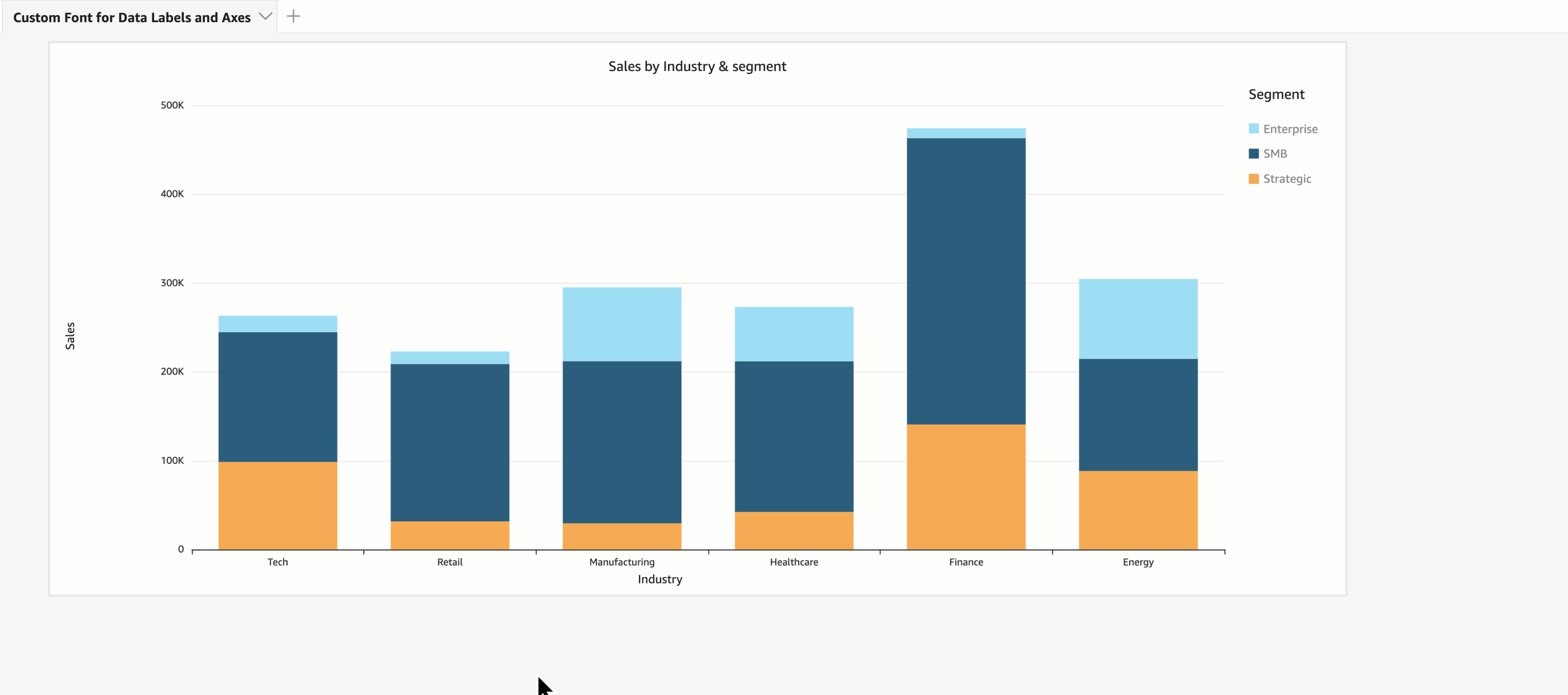
- Select the chart visual you want to update (for this example, we choose the Vertical Stacked Bar chart).
- Choose the pencil icon in the menu bar.
- In the formatting pane, expand X-axis or Y-axis.
- Adjust the following properties:
- Font family
- Text size
- Style (bold, italic, or underline, though note that underline is supported for axis titles, but not for axis labels)
- Color
Different chart types use different terminology:
- Bar and line charts: X-Axis and Y-Axis
- Pie charts: Values
- Heat maps: Rows and columns
To modify the font settings for data labels, complete the following steps:
- In the Format visual pane, expand Data labels.
- Turn on Show data labels.
- Adjust the following properties:
- Font family
- Text size
- Style (bold or italic)
- Color
Best practices for dashboard typography
When implementing font customization, follow these guidelines:
- Maintain consistency – Use the same or complementary fonts across dashboards so they feel unified
- Prioritize readability – Test on different devices and screen sizes; what looks good on a desktop might be cramped on mobile
- Use hierarchy – Emphasize key elements (axis titles, data labels) but don’t overwhelm; axes and data labels should support the main story, not compete with it
- Ensure good readability – Use good contrast settings, a sufficient font size, and avoid overly decorative fonts that reduce clarity
- Review context – Background colors, chart density, overlapping text all affect legibility—adjust orientation and style to reduce cluttering
Conclusion
These new font customization capabilities can help you build polished, user-friendly, and brand-consistent dashboards in Quick Sight. By configuring fonts for data labels and axes, you can improve readability, align with branding standards, and create dashboards that work for your users.
Start exploring these features today to enhance the visual appeal and functionality of your analytics. To get started, consider the following next steps:
- Review the Amazon Quick Suite User Guide
- Explore advanced visualization options in Quick Sight
- Join the Amazon Quick Suite community for more tips and best practices
About the authors
 Priya Kakarla is a Specialist Solutions Architect for Amazon Quick Suite, with experience spanning healthcare, finance, and digital-native businesses. She helps customers design and implement end-to-end Analytics solutions that drive data-informed decision-making. Passionate about empowering organizations through intuitive and scalable analytics, Priya is known for her strong customer obsession and commitment to delivering innovative, personalized solutions that achieve real business outcomes. Outside of work, Priya loves exploring new places, trying different cuisines, and spending quality time with her family and friends.
 Vasha Bhatari is a Senior Product Manager at Amazon Quick Sight, where she drives solutions that simplify BI migrations and help customers modernize analytics with ease. Since joining Amazon in 2017, she has led initiatives across last-mile routing optimization, database migration, and business intelligence, bringing broad experience to complex data challenges. Outside of work, Vasha is always planning her next trip, trying new foods, and exploring the best hiking and kayaking spots across the Pacific Northwest.
 Nicholas Soto is a Software Development Engineer in Amazon Quick Sight. He is passionate about building frontend systems that are fast and easy to use. Outside of work, he enjoys rock climbing and reading.